Site Links
Howdy, Stranger!
It looks like you're new here. If you want to get involved, click one of these buttons!
Quick Links
Categories
In this Discussion
Who's Online (0)
Graphic design needed

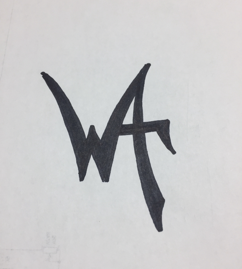
Calling on the community, I'd like my symbol made as an actual graphic. A lot of you guys are super talented with your imagine and 3D skills and I was wondering if turning this hand drawn symbol could be made into a graphic. I came up with this a long time ago as a moniker for stuff I build. The WA is for Woodring Acoustics. I'd like to have it look proper so it can be used to make name plates and logos on my PCBs and such.
If anyone would like to help me out with this, it'd be mucho appreciated!
Comments
Take a look at Inkscape Eric, I know that it can be drawn up with that free program, but I believe there is also a way to scan an image into it, and go from there.
I am no good at vector graphics despite having purchased an entire graphic arts suite from Corel. I am too old and stubborn to learn new software, apparently.
I have a friend who is a professional graphic artist - I can touch base with her and see if she is willing to trace it out for you.
I thought I had CorelDRAW on my work laptop and was going to do a quick trace using Quick Trace, but just realized that I didn't reinstall it on my new machine. JR, you should be able to convert the jpeg to a vector format with this tool: https://product.corel.com/help/CorelDRAW/540227992/Main/EN/Documentation/wwhelp/wwhimpl/common/html/wwhelp.htm#href=CorelDRAW-Tracing-bitmaps.html&single=true
I can give it a go this week as well.
I'm not sure how it works, but not sure tracing it would be best. It's not very symmetrical, so I don't know if all that can be corrected or what. It's not what I do, therefore I know when to bow out. Hence why I asked. Someone that does this sorta thing can do it no prob, where as I would have to struggle to find a program, figure out how to use it, figure out all the steps, ect..., just not what I want to do right now if one of us already rocks that skill.
Appreciate the suggestions🤘🏼
I don't have Illustrator on my laptop here at home, just Photoshop. I can convert this to a vector format tomorrow at work.
Awesome Tom!
How about if it were an aluminum logo -
Just hit trace button in Inkscape.
Stainless would work too.
InDIYana Event Website
Water jet the hell out of some logos.
😳
As awesome as that is, it still has the hand drawn aspects. Can you take it to the next level? Like the bottom tips of the W aren't the same, the top tips aren't equal, the horizontal bar through the A isn't level, those sorts of things. Is it hard to tweak stuff like that? Or is it a total redraw type of deal?
I'm going have to look into Inkscape!
I would love it if my company could ditch Adobe entirely. They can't even standardize basic commands between applications. But ditching them would be tough to do with all the active projects in 8 different offices.
Just my opinion but I really prefer the "not so perfect" look/feel of it. Maybe even up the bottom and top W tips a little but I wouldn't touch A's cross bar one bit.
I'll see what I can work up tomorrow at work. This 13" laptop screen is a pain when it comes to graphics work or video editing. Plus, I actually have more ongoing projects here at home than I do at work right now.")
Do you want the top points of the W to be pointy or a little more rounded as they are now?
I see what you mean, Craig, but it erks my OCD. I was thinking pointy, but your rendition above makes me lean towards rounded. What'd you guys think?
I like them a bit rounded, and I also like that the w point on the right that is part of the "A" is a bit wider.
Rounded for me too - it will make it easier for a CNC router to create . . .")
Aside: I see the symbol/acronym/initials as "WAf" and is appropriate for Eric's fine work.
Inspiration is the W is a speaker cross-section and the whole thing is audio waveform.
I see that now. I did not prior.
InDIYana Event Website
I ended up on the road today, so I decided to try Inkscape tonight. I really like some features of this program. I had to watch a few tutorials to figure out the basics. I'm still struggling with what should be simple tasks that I can do easily in Illustrator. It's just different interface and command structure.
Anyway, here are a few alternate versions.
Number 3 for the WIN, Gowa . . . Looks just right with that font. [to me].
Hell yeah guys!
Ok to be a bit picky...
Tom, can you level to cross bar of the A? I like the symmetry of the second one.
Gowa, bitchin effects! Don't like the curved tips on the W. Also looks like it got a bit skinny on the width?
See what you think -
😍
That's what I'm talking about! Hell yeah!
I'm guessing it can be black?
This is why I know when to ask for help. Thanks Tom!!
Black - no problem.
I like that way, too, Gowa! Thanks!
You guys knocked it out of the park, mucho appreciated🤘🏼😎🤘🏼
Why is my head filled with rabbids now?